Pages

Monday, January 6, 2014

All things blue and white are ALRIGHT!

So some blue and white love from me today. Inspiration for furnishing our new and rather big house is on my mind.

Blue with beige and white, traditional and just beautiful.

Love this room and the drapes, I am so thankful curtains are coming back. They soften rooms and can provide a pop of colour.


Some blue eye candy, accent colour is a softer blue which is very stunning.
Love the cane chairs, cane reminds me of my childhood, plus I love the texture.

Hoping to purchase a blue lounge for our living room with the fireplace. Wish me luck!

Sx

Friday, January 3, 2014

Handover count down, landscaping first round.....

We are almost at handover, which is so exciting. Just minus some useful things such as frameless shower screens and fly screens for the French doors, despite these couple of obstacles the count down is 3 weeks. Yes, I pinch myself regularly.

As promised some new pics.

Outside looking pretty, some painting still not complete but sooooo close.
Front of House:


Back of House: equally pretty. The landscapers start on Wednesday so new outside"decisions to make now. Looking for some traditional inspiration for gardens that will survive the tropics.
Front fence will be a picket that replicates some of the balustrade of the house to tie in.


Here are a few of my favourite things.....

No 1. The feature stone wall, and our Jetmaster gas heater. This our living room, and loving the fact there is no TV. That was a decision made on purpose as the media room is located in the room next door.


No 2. The view from our kitchen, and everything about the kitchen including the butlers pantry. The taps I am especially in love with. I am so glad we decided to go with a grey island bench, it was worth the risk.


No 3. The next fav is our walk in robe and ensuite. My favourite is the silver travertine laid in a French pattern that we have used in all the wet areas of the house. Worth the expense, I think I could sleep on it I love them so much.


So before overthinking how to furnish our baby, we have a very very blank canvas and have I mentioned our landscaper starts Wednesday?

To show you our first round bout.... at least its level? Ahhhhh
We are looking at bamboo on the rear boundary as a green screen.


Just so I see the progress, sometimes I need to look at where we started:
BEFORE:
 
AFTER:


Happy New Year everyone.
Sx


Friday, December 6, 2013

Better Late then Never....

So it has been a while and there has been so much progress.

We are at fixing and just now onto fitting off. The electrician and plumbers have started downstairs as painters have now finished and moved onto upstairs. A few things still to be done on the exterior such as painting, balustrades and battens. Internally just some plumbing and electrical plus the stone wall installation for the fireplace.

Every time I walk in I love it more and more. So here are some photo's my teenage daughter took this morning. External - loving how pretty it looks front and back.


The entry is looking great, I think it is welcoming. I am starting to think of rugs and console tables, loving Max Sparrow and Pottery Barn at the moment..... and yes, the front door will be painted white as well.


The powder room is located on the ground floor just off the hall... I still think I will wallpaper for some bathroom bling. The wallpaper is the same one I have been in love with all year. Everything looks like a scene out of CSI with the plastic, have to say the painters are extremely thorough. Underneath the plastic is a beautiful silver travertine in a French pattern... it's been used in all the bathrooms and balconies and will continue to be used externally as well.


I have more photo's but will load them on the gallery. However to finish off with my #homebeautiful #countryliving fireplace, this has been something we have loved since design conception.

The stone wall should be completed by Wednesday and will load the finish product.

Until then.
Sx

Tuesday, October 8, 2013

Wow and let there be Windows!

Follow my blog with Bloglovin

“A house without books is like a room without windows.”
Horace Mann

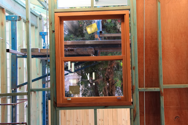
Our windows have arrived and are installed, a shout out to the amazing work by Timberware, the craftsmanship and quality is exceptional http://www.timberware.com.au/. They are all custom and beautiful, and I adore every window. We decided on double hung windows as we both grew up in bungalows and love the idea giving a "nod" to our childhood, not to mention I adore the character that comes with them. Since they have been installed I am now starting to thinking about how to dress them. Plantation shutters, roman blinds and beautiful sheer curtains.

I have been inspired by Gav and Waz's Byron Bay renovation, the design boys have just nailed it. I love looking for inspiration and there are so many wonderful projects out there. For some eye candy check out..
http://uniqueestates.com.au/Homes/Detail.aspx?id=ue329&wlid=b598392c-ab97-4d95-a322-0339bda6c8bf

Our cladding starts today and all the doors are delivered tomorrow.
I take a step back each time I do an afternoon inspection, as it now starts to feel like a home.

I just keep pinching myself.
Sx


Thursday, September 26, 2013

Movers and Shakers!!! I love love love shaker doors

So it's been a while in between posts but I have myself all shook up over cabinetry. We had the final check measure yesterday and I do believe the kitchen and wet areas need to be loved, we use them everyday and as much as we want beautiful we also need practical.
So the below kitchen eye candy below that has inspired me. And "yes", I am having a white kitchen but plan to play with colour in the bathrooms and laundry.

Picture sourced by Houzz, Traditional Kitchen by Saint Louis Architects & Designers Mitchell Wall Architecture & Design 
 
The kitchen is the hub of the home, and I love a traditional classic style which just invites people to gather, take a seat and break the bread!

I adore the easily achieved character found in simple things such as doors.

We have a shaker door profile going in with Caesarstone Frosty Carrinan 5141. After much deliberation Judy from Verandah House gave me the pro's and con's of marble and at the end of the day we want the kitchen to be practical. We have used Caesarstone before and were extremely happy with it. The edge will probably be a standard pencil edge which is also rather classic. There is a deeper grey product by Caesarstone called London Grey which I think is great as well.


My next favourite part of the structure is that all the cabinetry is seamless into the butlers pantry and back through to the outdoor BBQ area.

With a little bit of blackboard fun that will be on the door between the pantry and kitchen. Our internal doors are also a shaker profile.
 
And so the final picture should look like this.... yeah! Well in my head.


Enough shaking for one day.
Sx

Thursday, September 12, 2013

Beam me up Scotty! The Light plight

So I still have my head spinning with selections, and I was slightly panicked when I looked at our calendar and realised we have the electrician meeting for " rough in" next Wednesday! Sheesh .....

Kitchen pendant lights are my first priority, and I adore the below pictures for inspiration.

I have been in love with these bell pendant lights on the Pottery Barn US site for over 6 months, unfortunately they are not available in Australia, however I am still inspired to try and find something like this for over our kitchen bench. We have a rather large island bench going in and think 3 would look amazing.


Images sourced from www.potterybarn.com

I saw some amazing green pendant lights on a like minded bloggers site here
http://bungalowbliss.blogspot.com.au/

The other factor is the dining room/area, we are in search of something "rustic" that will flow with the house however not compete with the rock feature wall which will hold our heater. However the more I ponder, I think we will just keep the dining area free of distraction.

You can see what I mean by our floor plan, as the back of the house will be such an open space, I don't want anything competing or being too "busy". Reynolds Design http://www.reynoldsdesign.com.au/ has created an amazing floor plan, see our ground floor space below.

Next entry lights.... that will have to be another blog away!
Sx